Ever wondered how web design and conversion rates are linked together?
Does your website need a makeover? Should you spend a lot of money on a web designer to make your site look pretty? These and many other questions will be answered in this article.
In fact, as I’m writing this post my designer is redesigning this site.
I do a redesign maybe once every one or two years.
The main reason why I do them is because I get bored after a while (and I’m sure others get, too). Sometimes you just need to switch things up a bit to keep your work interesting.
Reinventing yourself, your brand and your business can be powerful if done correctly.
And design can be a part of that.
However, most people get way too obsessed with the minutiae of their business.
Budding entrepreneurs and marketing newbies often fall into this trap and overly focus on things like getting a perfect logo, hiring a fancy web designer or paying a lot for a professional video. In reality, these are the wrong things to focus on, especially when you’re just starting out.
Web Design and Conversion Rates: Not Your Typical Love Story
Most people make the following assumption about web design:
“Beautiful websites must convert better”
But is that really the case?
Let’s have a look.
Some of the most popular websites out there are not very pretty. In fact, some of them seem downright ugly and outdated despite their incredible popularity among billions of users.
Some examples of popular ugly websites:
- Wikipedia
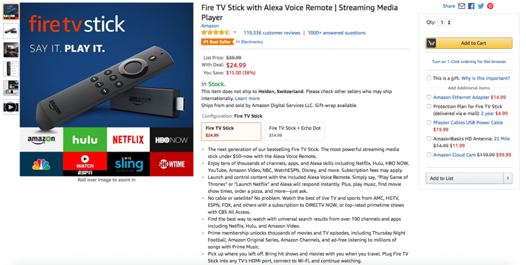
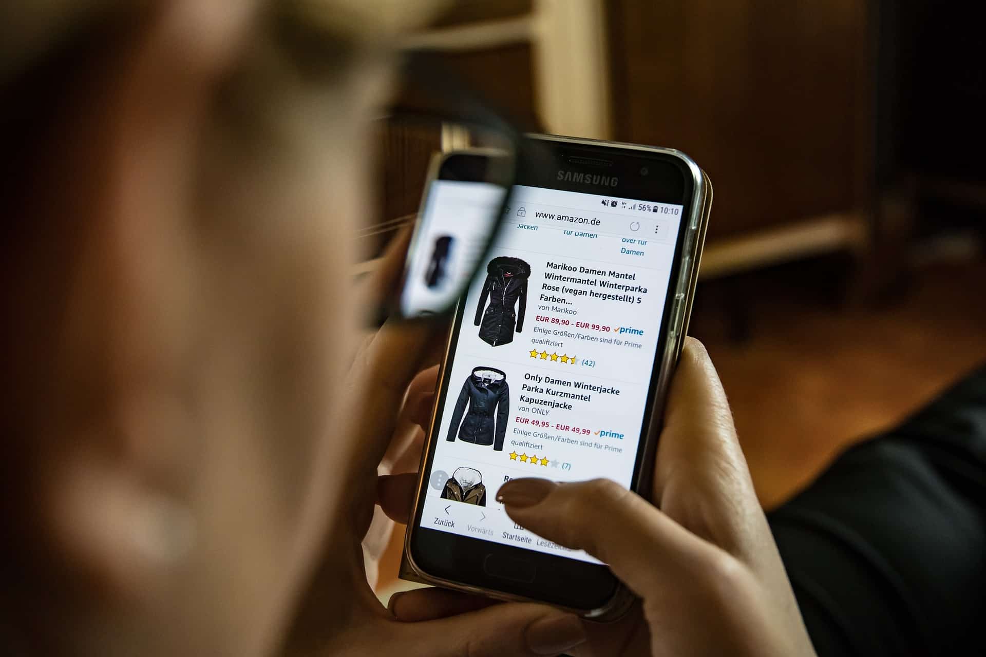
- Amazon
- PayPal
These are among the most popular and most visited websites on the internet.
Yet they aren’t particularly pretty.
Heck, I have plenty of students who have launched online stores that look prettier than Amazon. But some of them have never seen a sale despite getting a decent amount of traffic.

On the other hand, I’ve seen countless online stores generating $10,000-$30,000 a month.
What’s really interesting is that most of them are ugly.
So we have to be careful when making assumptions about web design and conversion rates.
How Can Ugly Websites Generate $30,000 a Month or Even Millions or Billions per Year?
I believe the answer isn’t even necessarily linked to design.
Someone who throws up an ugly website with a crappy logo might be able to generate $30,000 per month, but only if the person focusses on what really matters in business.
And what really matters is marketing and sales.
If you get marketing and sales right, you have a successful business (at least short-term).
Nothing else matters.
Why?
The answer can be found in the Pareto principle or the 80/20 rule.
In business, 80% of your results will come from just 20% of things. And as you’ve probably already guessed by now, those twenty percent amount to marketing and sales.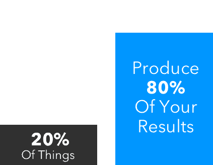
Your logo, web design, store layout and button colour are part of the 80% that matter less.
Here’s the surprising truth.
If you get 80% of things that don’t really matter right, but mess up the marketing and sales part, you will fail. You could have the most beautiful website and a logo from a professional graphic designer. Your website could even win an award and yet nobody would buy a single product.
On the other hand, if you mess up 80% of things that don’t really matter, but get the marketing and sales part right, you will make sales every month and your business will thrive.
It’s as simple as that.
That’s why students sometimes send me links to their beautifully designed online stores and wonder why they’re not making any sales. Heck, even I am surprised by how beautiful some of these online stores look. This must have at least some impact on our sales, right?
But then some other student sends me a link to his online store that looks so ugly that I almost fall off my chair. And yet that store is generating more than $10,000 a month.
The bottom line is this:
Web design and conversion rates are only loosely related.
Sure, you can increase your conversion rate by split-testing button colors and improving different design elements on your website, but we’re talking about small gains.
The big gains come from marketing and sales.
So does your website need a makeover or should you stop worrying?
And more importantly.
Do Ugly Websites Convert Better?
I’ve demonstrated why web design and conversion rates aren’t as closely linked as you think.
Ugly websites generating a lot of sales can be explained with the Pareto principle or the 80/20 rule. The reason why an ugly site is getting a lot of sales is not because it’s ugly. It’s because the website is using marketing and sales strategies that result in this type of revenue.
One could say these sites are succeeding despite being ugly.
But still, could there be more to it?
When looking at some of the most popular websites out there like Google, Reddit, Amazon, PayPal and Wikipedia, one could conclude that ugly and old looking websites convert better.
Crazyegg recently published an article explaining why ugly websites often convert better.
What was the conclusion of the article?
It seems that most ugly websites have few distractions.
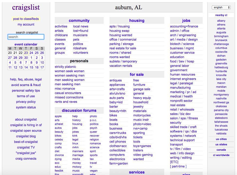
Sites like Craigslist, Amazon and Wikipedia have few distractions.
Maybe these sites aren’t extremely popular because they’re ugly but because they effectively reduce distraction and make it easier for users to find a classified ad, complete a search or buy something online. Ugliness might just correlate with the popularity, but not cause it.
That being said, you shouldn’t try to make your website ugly intentionally.
(Although it would be a fun experiment)
You should focus on making your site user friendly and remove distractions.
Here’s the verdict:
- Focus on the 20% that matter most in your business, which is marketing and sales
- Improve the other 80%, such as design and layout, but don’t overemphasize it
- Remove distractions and improve usability on your website
So does your website need a makeover?
Maybe it does.
But if you decide to redesign your website, do it for the right reasons.
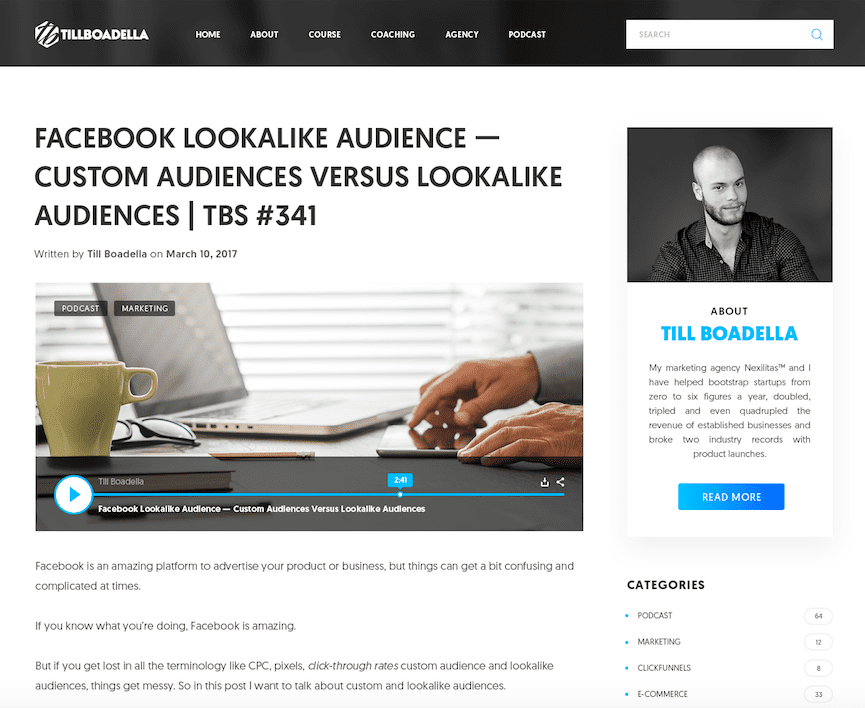
I’m currently redesigning my blog because I am bored to death by its design. Plus I think it’s worth investing some money to make it appear more professional. I’m also going to remove distractions and make the blog easier to navigate. But keep in mind that this site has been generating tens of thousands of dollars every month because of good marketing and sales.
Here’s a mockup of the new design:
Maybe one day people will think this blog became successful because of its looks.
But I’ll know they are wrong.
I’ve been blogging with a relatively ugly blog design forever.
Read More: 15 Best Blogging Platforms
Where I exceed and where I’ve always exceeded is marketing and sales. That’s where most of my focus goes and that’s what’s made my various businesses successful.

So does your website need a makeover?
I’ll let you decide.
You now have all the information you need to do it for the right reasons.
If you do redesign your website, focus on usability and removing distractions.
If you decide against redesigning your website, the good news is you can save the money you were about to pay an expensive graphic designer and invest it in marketing and sales instead.
This can be a relief, especially if you’re a bootstrapping entrepreneur on a shoestring budget.




Top 25 Digital Marketing Articles – Week of 12/01/17 | UpCity
[…] Till Boadella emphasizes the need to make your website user friendly and remove distractions for improving your Conversion rate. […]
Top 25 Digital Marketing Articles – Week of 12/01/17 | Life Solutions Core
[…] Till Boadella emphasizes the need to make your website user friendly and remove distractions for improving your Conversion rate. […]
William
I was pre-occupied in getting mywebsite looking “pretty”, However, having read this post, I realize an ugly site can be successful by concentrating on things that really matter, like Sales & Marketing
William